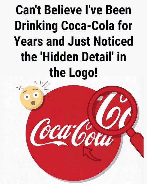
Have you ever noticed what looks like a hidden smile in the Coca-Cola logo? The flowing curve of the second “C” in “Cola” can resemble a subtle grin, giving the famous lettering a warm and friendly appearance. Once someone points it out, it can be surprisingly difficult to look at the logo without noticing it again.
However, the smile was not an intentional hidden message. The original script was created in the 1880s by Frank Mason Robinson and was inspired by the elegant Spencerian handwriting style popular at the time. There are no known historical records or design documents indicating that the lettering was created to include a smile or secret emotional symbol.
The interesting part is how our brains naturally recognize familiar patterns, faces, and emotions in ordinary shapes. This tendency, combined with the positive feelings and nostalgia associated with Coca-Cola’s branding, may make the lettering appear even more expressive. Ultimately, the smile is less about a hidden design feature and more about how our minds interpret the shapes we see every day.